The Story Behind the Creation and Meaning of the Phú Mỹ Hưng Center Logo
1. The Story Behind the Creation of the Phú Mỹ Hưng Center Logo
Phú Mỹ Hưng Center was created from a simple yet deeply human aspiration: to build a professional and reputable website providing accurate information about the real estate projects of Phu My Hung Development Corporation. Customers visiting Phú Mỹ Hưng Center can find comprehensive project information without having to consult numerous other sources.
During the brand-building process, Kim Thùy Phú Mỹ Hưng, founder and author of the Phú Mỹ Hưng Center website, realised that a high-class real estate brand could not be complete without an iconic visual identity — a logo that was not only visually appealing but also rich in philosophical depth, conveying the entire mission and core values towards which the project aspires.
After carefully researching East Asian culture, feng shui philosophy and international real estate branding design trends, Kim Thùy Phú Mỹ Hưng created a logo that combines the spirit of traditional culture with a modern and sophisticated appearance — befitting Phú Mỹ Hưng Center’s position in Vietnam’s high-end real estate segment.
2. The Meaning of the Phú Mỹ Hưng Center Logo
2.1. The Meaning of Each Element in the Logo
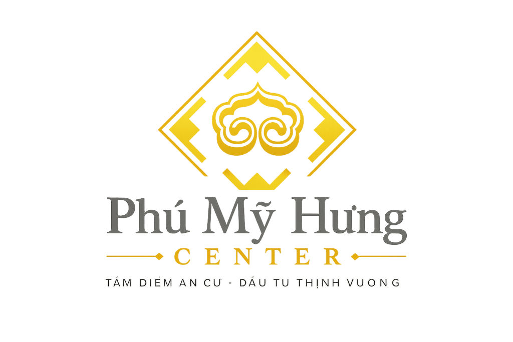
The Phú Mỹ Hưng Center logo is designed around the philosophy of “Peaceful Living – Prosperity – Endurance”, with every visual element carefully selected to express the brand’s vision and values.
Golden central emblem – The convergence of essence, abundant blessings and prosperity
At the centre and most prominent position in the logo is a symmetrical golden decorative emblem, meticulously engraved with swirling, flowing lines arranged in the rhythmic style of East Asian court art. The emblem evokes the shape of a mythical animal’s face — a familiar symbol in Vietnamese architecture and culture, representing protection, safeguarding and peace for the homeowner.
The two symmetrical spirals on either side of the emblem symbolise the harmony of Yin and Yang, the foundation of balance and prosperity in Eastern philosophy. They also serve as a metaphor for the perfect meeting and harmony between investors and opportunities, and between residents and an ideal living environment at Phú Mỹ Hưng Center.
Diamond-shaped frame – A solid foundation and enduring value
Surrounding the central emblem is a balanced diamond-shaped frame — a geometric form created by four refined golden lines, forming the shape of a diamond. Diamond is the hardest naturally occurring material and cannot be destroyed by time, symbolising durability, enduring value and irreplaceable distinction.
The diamond shape also symbolises the convergence of the four directions — East, West, South and North — all pointing towards a single central point: Phú Mỹ Hưng Center. This is the focal point towards which all opportunities for both living and investment converge, in keeping with the slogan established by the brand.
Royal gold – Wealth, prosperity and guiding light
The entire emblem, diamond frame and the word “CENTER” are rendered in bright metallic gold — the colour of royalty, wealth and good fortune in East Asian culture for thousands of years. Gold is not only the colour of sunlight, which brings vitality and energy, but also the colour of pure gold — a symbol of enduring assets and ever-growing prosperity.
By choosing metallic gold as its main colour, Phú Mỹ Hưng Center sends a clear message to the market: every apartment and every floor plan here is a golden asset — retaining its value over time and growing with each stage of the urban area’s development.
“Phú Mỹ Hưng” in charcoal grey – Solid credibility and enduring distinction
The brand name “Phú Mỹ Hưng” is written in an elegant Serif typeface, in a large size and charcoal grey — the colour of granite, sturdy steel and enduring structures. Placed beside metallic gold, charcoal grey creates a perfect contrast: gold is light, while grey is the foundation — together affirming that Phú Mỹ Hưng Center is a brand that is both radiant in value and solid in credibility.
The Serif typeface, with its graceful serifs, also evokes classical architecture — a hallmark of iconic structures that transcend time.
“CENTER” in gold – The centre of every value
Directly beneath the brand name, the word “CENTER” is presented in a balanced typeface, written entirely in capitals with evenly spaced letters, in striking metallic gold. This is not merely a term describing the type of real estate; it is a statement of position:
Phú Mỹ Hưng Center is the centre — the centre of a bustling urban area, the centre of a comfortable life, the centre of profitable investment opportunities and the centre of a distinguished residential community.
Decorative line with arrows and diamond – Connection and direction
Between the brand name and the tagline is a decorative horizontal line featuring arrow symbols pointing in opposite directions and a small diamond at the centre. This image conveys the meaning of connection and guidance — Phú Mỹ Hưng Center is the bridge that brings customers to the ideal living environment and profitable investment opportunities they have always sought.
The two outward-pointing arrows also express the brand’s constantly expanding vision — always developing, always reaching further and always placing customers’ interests at the centre.
2.2. Phú Mỹ Hưng Center’s Slogan: “A Focal Point for Living · Prosperous Investment”
It is no coincidence that Phú Mỹ Hưng Center chose the slogan “A Focal Point for Living · Prosperous Investment” — it is the most concise summary of all the value the brand promises to deliver to customers.
“Focal point” — this refers not only to a prime central geographical location but also to a convergence point of refined lifestyle values: high-class amenities, a civilised community, a clean environment and outstanding security.
“Living” — this reflects Phú Mỹ Hưng Center’s deepest mission: to give every family a true home where generations can live, bond and grow with peace of mind.
“Prosperous investment” — this affirms that choosing Phú Mỹ Hưng Center is not merely a choice of home but also a smart investment decision, because the real estate here consistently lies within a zone of sustainable growth throughout each stage of the urban area’s development.
2.3. The Overall Meaning of the Slogan
The slogan “A Focal Point for Living · Prosperous Investment” is Phú Mỹ Hưng Center’s dual promise to its two key customer groups: owner-occupiers and investors. It affirms that two seemingly different needs — establishing a home and career, and achieving sustainable returns — can be met simultaneously at one address: Phú Mỹ Hưng Center.
3. Conclusion
The Phú Mỹ Hưng Center logo is a refined fusion of East Asian representational art and modern brand design language. Every line, colour and shape has been deliberately calculated, together telling one consistent story: this is a reputable, distinguished and enduring real estate brand where lifestyle value and investment value always go hand in hand.
When customers look at the Phú Mỹ Hưng Center logo, they see more than a brand symbol — they see a commitment, a promise and a journey to create a prosperous and peaceful life together at the heart of one of Vietnam’s most modern urban areas.
Visit phumyhungcenter.com to discover more about the projects and the special values that Phú Mỹ Hưng Center brings.